Why Is the 2026 Color of the Year White? And Why Neutrals Still Matter in Luxury Design
The 2026 Color of the Year: A Return to Quiet
Yes – the 2026 Color of the Year is white. And while that announcement has sparked debate across the design world, the choice reflects something deeper than trend fatigue. After years of bold, saturated color stories, this moment signals a collective desire for calm, clarity, and restraint.
The whites defining 2026 are not stark or sterile. They are warm, nuanced, and intentionally soft – designed to create breathing room within a space. This quieter palette allows the focus to shift away from color alone and toward the elements that give a home its soul: materiality, craftsmanship, and thoughtful layering.
Why White Feels So Polarizing
White has always been one of the most emotionally charged colors in interior design. For some, it represents peace and simplicity; for others, it raises concerns about coldness or lack of personality. Much of this reaction stems from the idea that white is an absence of design rather than a deliberate choice.
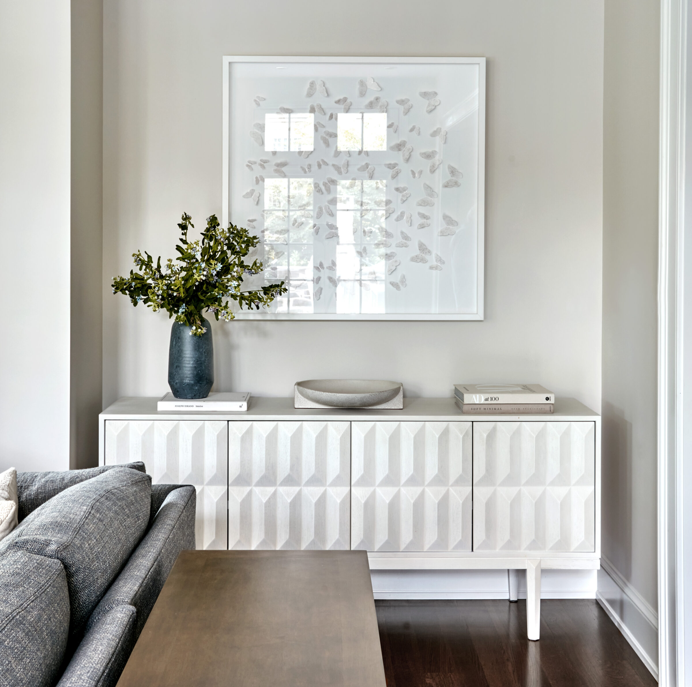
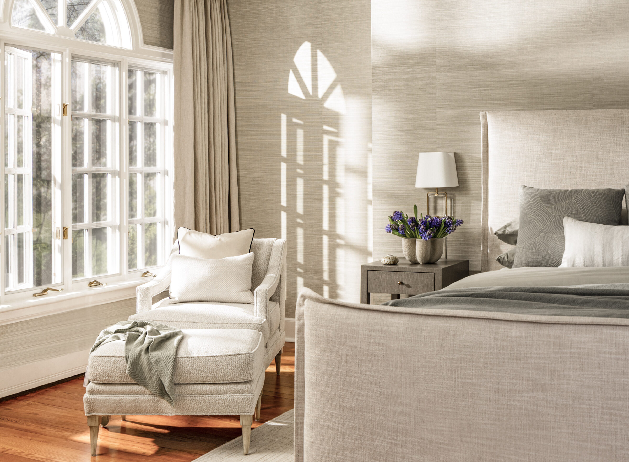
In reality, working with white requires more intention, not less. Without variation, white can feel flat. But when layered thoughtfully, it becomes expressive. Subtle undertones and a range of finishes – matte, honed, polished, woven – create contrast that keeps a neutral space visually engaging and deeply considered.
Why Neutrals Work Best When Texture Takes the Lead
In luxury interiors, neutrals are most successful when texture becomes the primary design language. When color steps back, every surface, material, and form has the opportunity to stand out on its own.
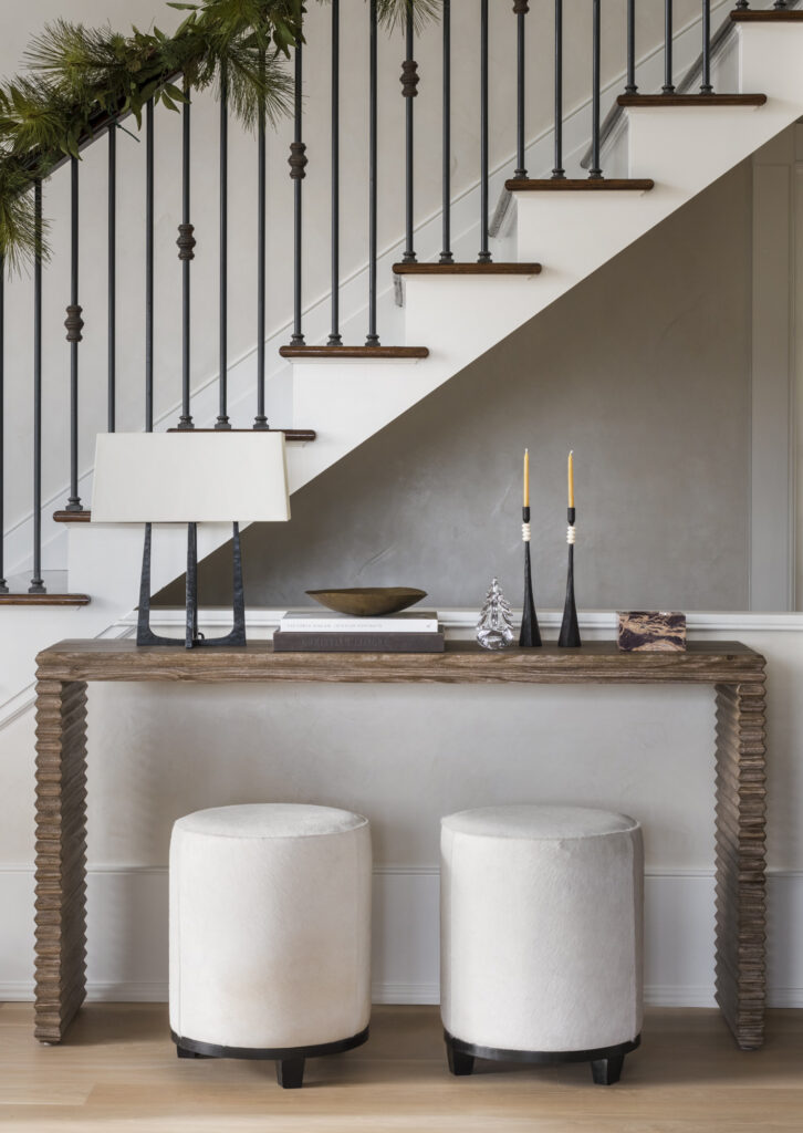
A sculptural chair upholstered in bouclé feels more intentional against smooth plaster walls. A richly grained wood table gains presence when paired with soft linens or woven rugs. Stone, metal, wood, and textile each bring their own character – and it’s the contrast between them that creates depth without visual noise. This is where neutrals truly shine: not through sameness, but through variation.
Choosing the Right White Is a Design Decision
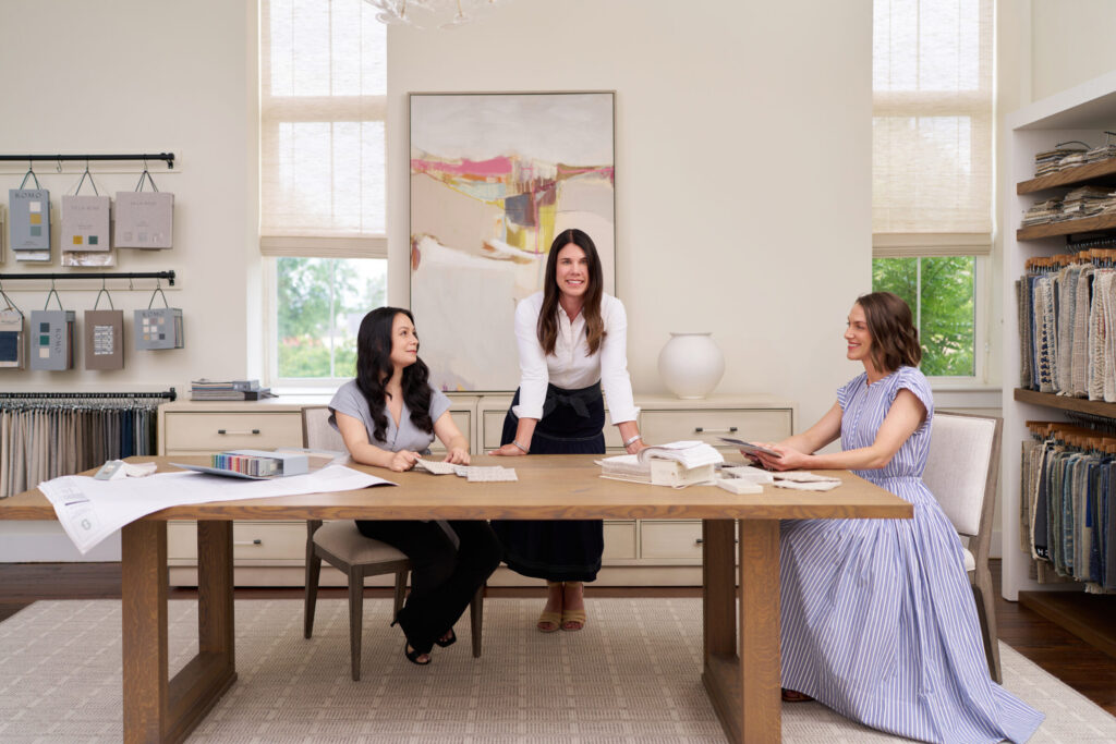
At Glenna Stone Interiors, choosing white is never a one-size-fits-all decision. We consider natural light, architectural details, and surrounding materials before selecting a palette. Just as importantly, we look at how textures will interact – where softness is needed, where structure should appear, and how finishes will play off one another.
Layering linen with wool, pairing honed stone with polished metal, or balancing tailored upholstery with organic materials ensures that each piece has presence. This thoughtful contrast allows a neutral home to feel warm, dimensional, and intentionally composed rather than uniform.
Why White Endures
The conversation around the 2026 Color of the Year may be loud, but the takeaway is quiet: a renewed appreciation for thoughtful, timeless design. White endures because it adapts – providing a foundation that elevates texture, craftsmanship, and personal expression.
When neutrals are layered with care, every element is allowed to stand on its own while contributing to a cohesive whole. In a world that often feels overstimulated, this balance offers something increasingly rare: a home that feels calm, considered, and deeply livable.
Ready to explore a palette that reflects how you want to live in 2026? We’d be honored to guide you.
-Glenna