Villanova kitchen renovation
We’re taking a look back in the archives at one of our favorite projects: this Villanova kitchen renovation! Working with these clients is always a pleasure, and we so enjoyed creating this space for them. Having partnered with the clients on the previous two phases of their home design, we developed a great rapport and rhythm that made the design so much fun!
The evolution of our Villanova kitchen renovation
We’ve talked about kitchen renovations before on the blog, and noted that they’re no small task. That was especially true for this project, which entailed a complete redesign including appliances and plumbing. While the footprint didn’t change, the clients wanted a lighter, brighter feeling in a kitchen without windows. They also wanted the design to flow with the style of the rest of their home, in an “updated classic” aesthetic.
Before
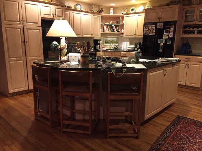
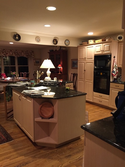
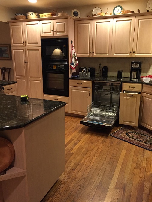
The existing kitchen featured an angled island with crowded seating as well as an inefficient layout, particularly for a couple who enjoy cooking together, hosting, and entertaining frequently. Our goal was to create a more intentional design with a timeless, fresh feeling.
The plan
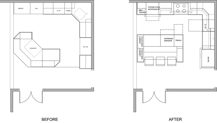
One of the biggest design challenges was adhering to the clients’ requirement of having no cutouts in the kitchen island, but rather a large solid surface for prepping and serving. We included a more furniture-style island to be consistent with other design elements in the home. In addition, we reconfigured the appliance layout including a new range, convection oven, microwave, paneled refrigerator, and dishwasher. We added a wall-mounted steam oven, undercounter beverage center, and warming drawer in the island. The new plan has a much more natural flow with added amenities to make hosting holidays and gatherings a snap!
After
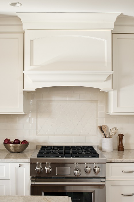
The result of so much attention to detail and collaboration? A kitchen perfectly tailored to our clients’ wants and needs. The creamy tile backsplash and Taj Mahal quartzite counters and island combine with the custom cabinetry to reflect natural light from the windows opposite. Adding glass fronts to some of the cabinets gave even more of an airy, open feeling. By extending the trimwork all the way to the ceiling, the space feels larger.
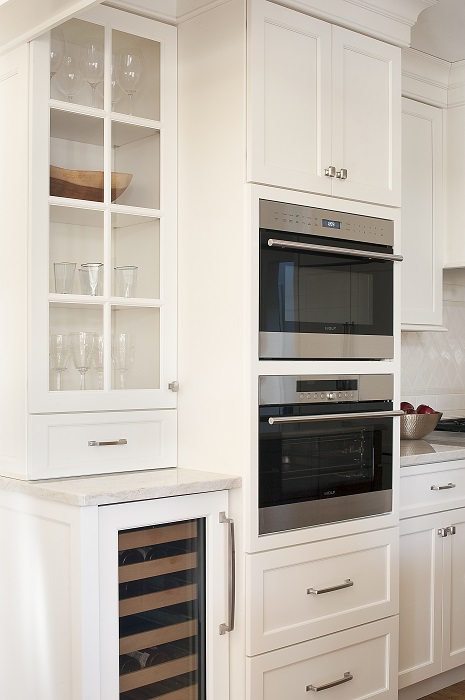
One of the key elements of this design was the highly customized cabinetry and millwork. Every inch was accounted for, and designed to work for our homeowners (instead of the other way around). Even the new range hood was fabricated to fit perfectly.
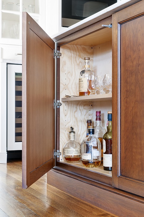
Lighting details like the elegant pendants over the islands and the interior lighting in the glass fronts add a final touch of polished ambiance. Last but not least, we can’t leave out one of our favorite features. Our clients wanted a fully stocked bar in the kitchen for cocktails, and we designed touch open panels on the side of the island that reveal two discreet cabinets for bottles and barware! They nicknamed it “the speakeasy” and love it, which means that we nailed it!
Want to talk about your own custom kitchen design? Get in touch with us!
All completed project photography by Rebecca McAlpin
Want our weekly blog post delivered right to your inbox? Click here to sign up!
________________________________________
Glenna Stone Interior Design is an award-winning Philadelphia interior design firm serving Philadelphia, the Main Line, and surrounding cities. Utilizing her background and training in interior design, architecture, and engineering, Glenna specializes in creating interiors for residential and commercial design settings. We invite you to visit our website, view our portfolio, and catch up on the latest interior design concepts on our blog!