Villanova Primary Bath Redesign
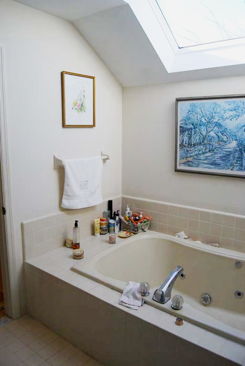
Our clients’ original Villanova primary bath presented two main problems: it was divided by a wall and had little natural light. This combination created a cramped feeling, and our clients wanted more: more openness, more light, more convenience, and more upscale materials. Through strategic space planning and a collaborative design process, we created an airy, upscale bathroom that checked all of their boxes!
Unifying the space
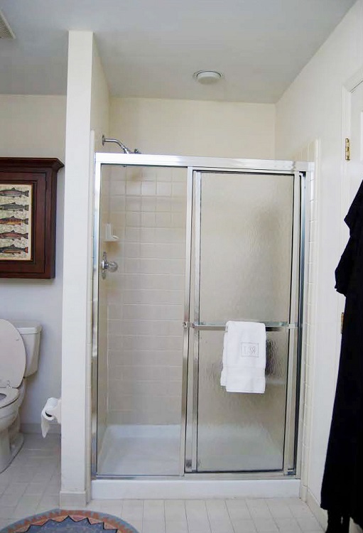
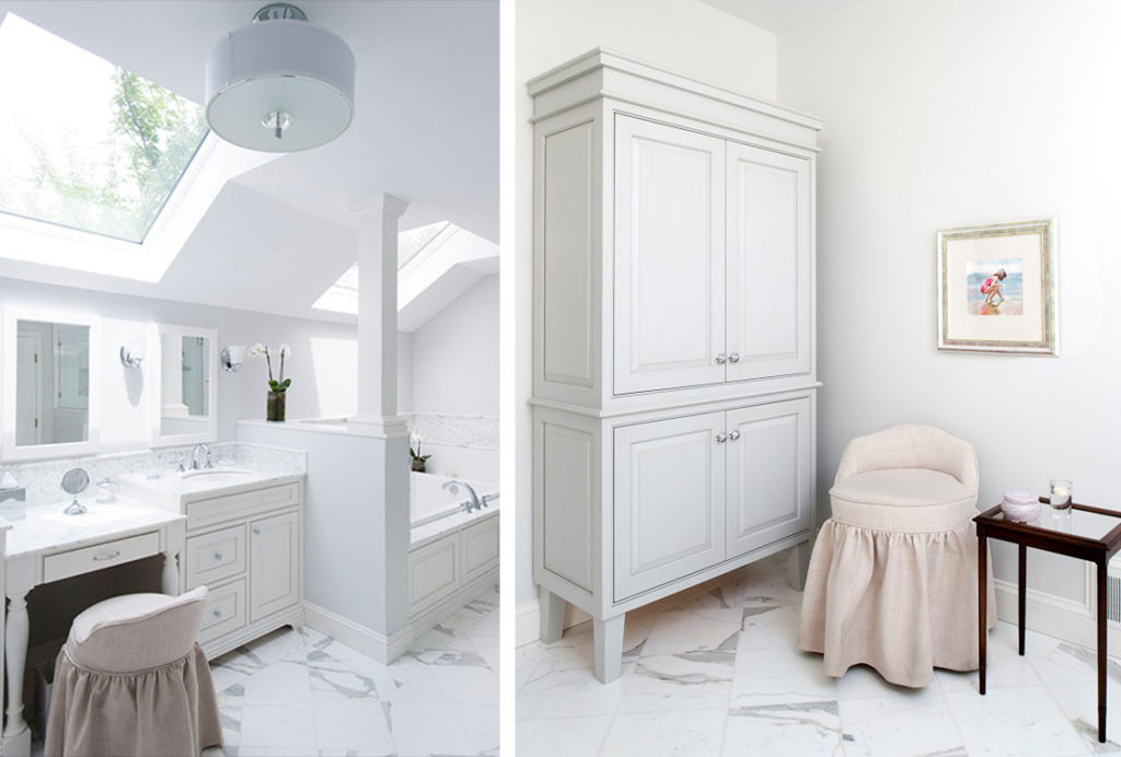
The existing bathroom was split into two rooms. One contained the tub, shower, and toilet, with the vanity in the other. This layout was awkward, especially with the oversized tub dominating its space and dwarfing the shower. The vanity area had no natural light source, and an awkward soffit above made it feel even smaller. As our first order of business, we removed the wall separating the two rooms. We added in a half wall with column to define the tub area and add architectural interest. This also allowed us to enlarge the shower without moving the doorway, which would have made compromises to the primary bedroom layout.
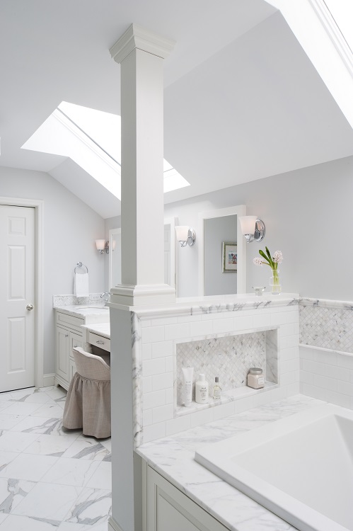
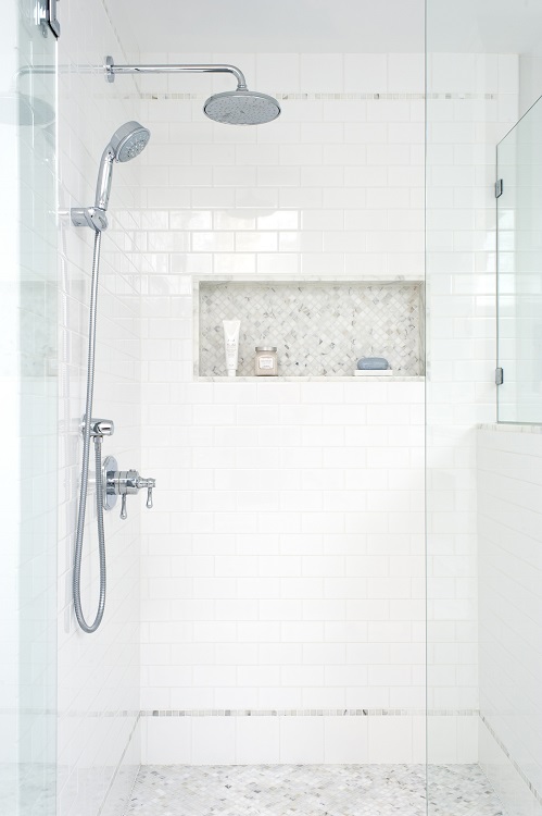
A smaller tub deck features an elegant Calacatta marble surround, along with a custom Calacatta mosaic storage niche which provides elegant and practical storage. In the redesigned shower, the coordinating niche and floor provide cohesion. Additionally, we upgraded the shower fixtures to include both a rainhead and handshower for a luxurious experience. The shower’s glass enclosure contributes to the openness of the space.
Focusing on the details
On the opposite side of the half wall, we made substantial changes to the vanity area as well. The most dramatic change involved replacing the awkward soffit with a skylight to mirror the one over the tub. While the skylights allow natural light to flood the room, sconces above the custom vanity provide additional lighting. The Calacatta backsplash continues the design from the tub and shower, with three elegant mirrors floating above that anchor the design and reflect the light. The center mirror is actually a custom recessed medicine cabinet for additional storage.
Of course, in a primary bath with so much light and natural stone, adding welcoming and comfortable touches is key. In order to balance these elements, the overhead light’s fabric drum shade along with the custom upholstered vanity chair lend softness and warmth. One of the clients’ last wish list items involved linen storage, but building a closet would have taken away some of the carefully carved out space. Instead, we designed a standalone linen cabinet in soft gray that adds to the elevated mood of the new bathroom.
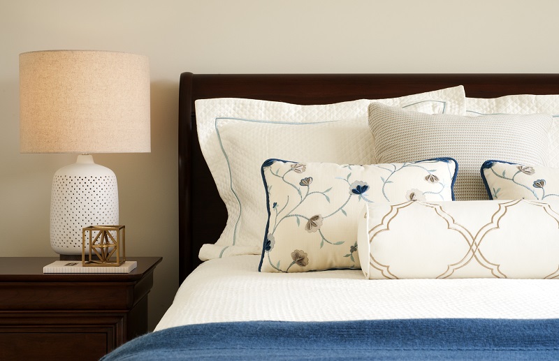
We didn’t stop with this stunning bath redesign, however. We also created a soft, layered, and serene bedroom.
Want to see the full reveal of our Villanova primary bath and bedroom? Pick up the September 2022 issue of Main Line Today now!
Project photography by Rebecca McAlpin
Want our weekly blog post delivered right to your inbox? Click here to sign up!
________________________________________
Glenna Stone Interior Design is an award-winning Philadelphia interior design firm serving Philadelphia, the Main Line, and surrounding cities. Utilizing her background and training in interior design, architecture, and engineering, Glenna specializes in creating interiors for residential and commercial design settings. We invite you to visit our website, view our portfolio, and catch up on the latest interior design concepts on our blog!