Main Line Dining Room
While we designed the family and breakfast rooms with a more relaxed vibe, our Main Line dining room is the “crown jewel” of the home. We envisioned it as a kind of salon for intimate dinner parties, and focused on making a statement in this space.
A showstopping Main Line dining room
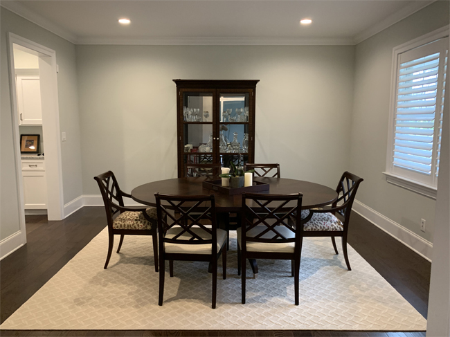
The existing dining room was perfectly fine; it was accessible from both the entry and the walkthrough pantry, with windows at the front of the house to allow for natural light. However, our clients didn’t just want a perfectly fine dining room. They wanted a showstopper.
In order to elevate the space, we introduced luxurious touches and lots of texture. Every element from lighting to wallpaper was thoughtfully selected. We needed the space to feel special, but not jarring against the rest of the first floor. Achieving this took a balancing act. Additionally, our clients wanted to begin their fine art collection with an original piece for their new dining room, so everything within had to fit perfectly.
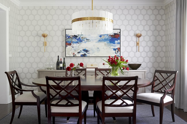
The pièce de résistance is a stunning painting by Christine Hayman. When we visited a local gallery together with our clients, they were particularly drawn to her work. They had not yet made their final selection when we began the design, but we knew that the painting would be abstract and textured with strong colors.
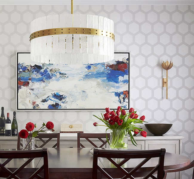
The geometric wallpaper’s scale was key; it serves as a background that highlights but doesn’t interfere with the bold strokes of oil on canvas. A pair of sculptural brass sconces flank the painting. In addition to the existing recessed lighting, we selected an upscale-meets-edgy chandelier in brass and seeded glass to boost the wow factor.
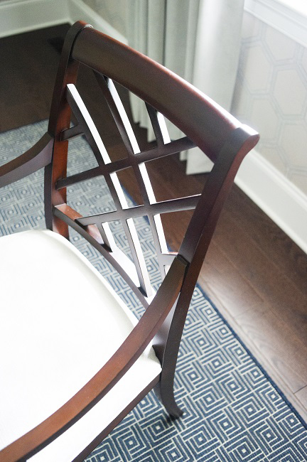
Our clients loved their dining table and chairs, so we reupholstered the cushions in an ivory performance fabric that creates a beautiful contrast with the dark wood. A new area rug in indigo with a subtly geometric pattern plays off of the modern Chippendale chairs and the wallpaper.
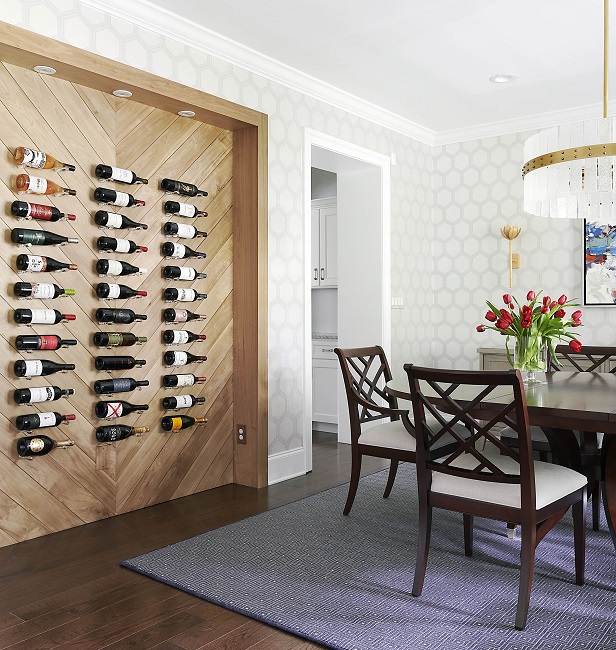
Last but definitely not least, we designed a custom display for their impressive wine collection. No ordinary wine rack would do in a space like this. Instead, we created a recessed feature wall with millwork and recessed lighting. Acrylic pegs lend the illusion of floating bottles. The effect is pretty incredible, if we say so ourselves!
Overall, we took the space from drab to fab and our clients are thrilled. Compare the before and after for yourself!
Project photography by Rebecca McAlpin
Want our weekly blog post delivered right to your inbox? Click here to sign up!
________________________________________
Glenna Stone Interior Design is an award-winning Philadelphia interior design firm serving Philadelphia, the Main Line, and surrounding cities. Utilizing her background and training in interior design, architecture, and engineering, Glenna specializes in creating interiors for residential and commercial design settings. We invite you to visit our website, view our portfolio, and catch up on the latest interior design concepts on our blog!