Bold Meets New: Our Gladwyne Home Reveal Part 1
Last month, we took you on a holiday tour through the pages of Traditional Home magazine as they included our clients’ Gladwyne home decked out for Christmas. ‘But how does it look the rest of the year?’ you asked. Happily, we can show you now. Come with us as we tour through the first floor of this expansive renovation.
Intentionality with Personality
A large part of the work we do before we ever begin selecting furnishings or finishes is creating the vision and plan for how the homeowner intends to live in and with their surroundings. There’s real intention and understanding of how each space will make people feel, where their eye leads them, and how the proper flow feels effortless, or not.
Our homeowners are a young, vibrant family who love to have guests in. Sometimes their fêtes are swanky, other gatherings are decidedly casual. They have marathon baking sessions with their kids. And they need a stylish and well-appointed office for their work. They found a home with outstanding features but it was outdated and did not feel true to their modern lifestyle.
You Had Me at Wow
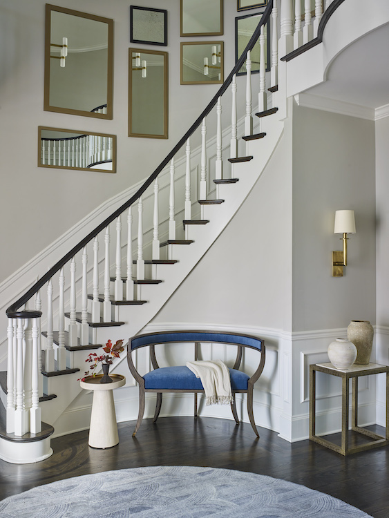
Originally the two-story entry had a dual staircase. Working with architects at OSK Design Partners, one set of stairs was removed, leaving the other as a focal point highlighted by beautiful millwork and a gallery of framed mirrors curving up the wall. This is the home’s first statement, where we created an intentional moment to pause, take in the soaring ceiling and the view into the gathering spaces.
Color Cues
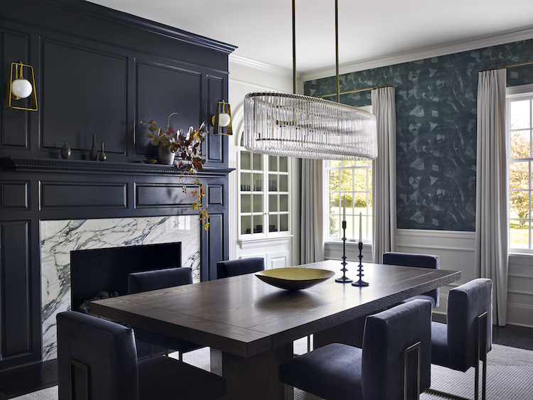
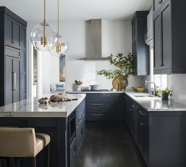
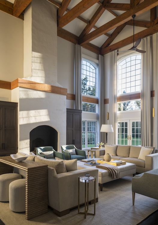
As you move through the main floor, you will see that spaces used while entertaining feature “wow” moments illustrated with decorative wallcoverings, bolder paint colors and statement lighting.
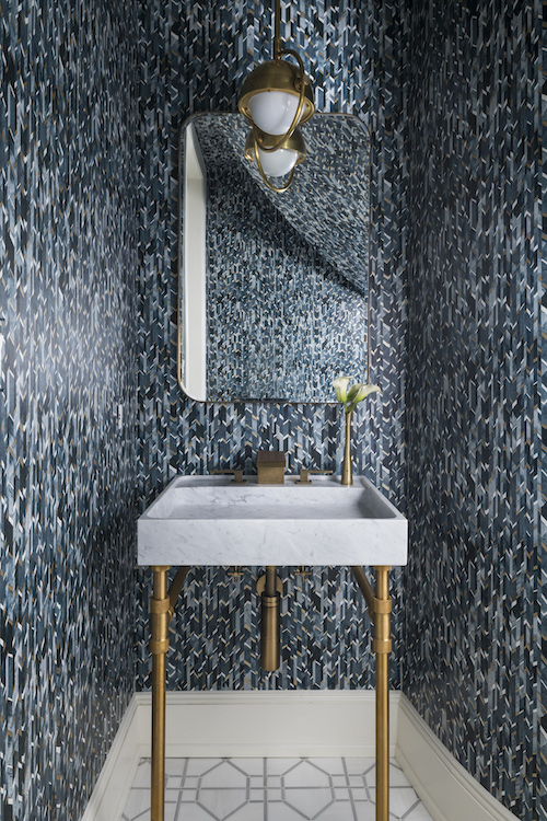
The more family-forward, high-traffic spaces sport a more neutral palette inferring a more casual sense. What may seem subtle is, in fact, a nod to some of the home’s most focal features.
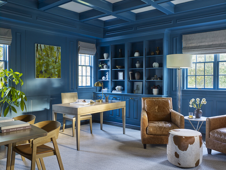
Workplace Wonder
A stylish, well-appointed and creative office was a must-have for the homeowners. We turned this space into a stunning workspace/library with a bold, vibrant paint choice (Sherwin-Williams Turkish Tile) and striking furnishings.
Coming soon, we will reveal the secrets of the second floor of this beautiful home. We hope you are as eager to see them as we are to share them with you.
Do you prefer the bolder color choices or the lighter selections from this first floor reveal? Pop your response into the comments below.
Want our weekly blog post delivered right to your inbox? Click here to sign up!
________________________________________
Glenna Stone Interior Design is an award-winning Philadelphia interior design firm serving Philadelphia, the Main Line, and surrounding cities. Utilizing her background and training in interior design, architecture, and engineering, Glenna specializes in creating interiors for residential and commercial design settings. We invite you to visit our website, view our portfolio, and catch up on the latest interior design concepts on our blog!