Design details: Trim
If you’ve been following our projects for a while, you may have noticed one of our favorite design details: trim! From window treatments to custom throw pillows, trim adds a polished and unique look. Here are five fun ways that we’ve used trim in our projects.
Our five favorite trim details
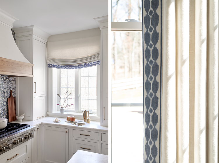
1) Malvern kitchen and breakfast room
For the window treatments in our Malvern kitchen and breakfast room, we drew inspiration for the tape trim from the handpainted backsplash tiles behind the range. The same trim that bands the soft Roman shade in the kitchen borders the drapery panels in the breakfast room. The result is sophisticated cohesion.
2) Washington Square West living room
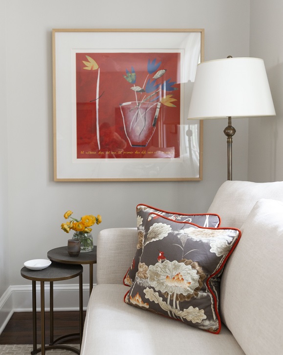
The pattern we selected for the custom throw pillows in our Washington Square West living room was inspired by the clients’ one-of-a-kind antique wooden chairs from China. We wanted to bring that design influence into the space, and balanced the serene pattern with a corded trim that picks up the hints of red within. This choice of trim also ties in the artwork as well. It’s a subtle detail that elevates the overall design.
3) Wynnewood en suite bath
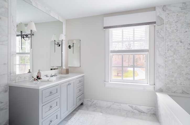
Luxury was the guiding principal in our Wynnewood bedroom, dressing room, and en suite bath. The mix of Calacatta marble tiles in the bathroom inspired the tape trim on the tailored cornice, with its blend of gray and silver. By keeping the design here simple and elegant, we allowed the window treatments to enhance the design by adding another layer of softness to the overall palette.
4) Society Hill living room
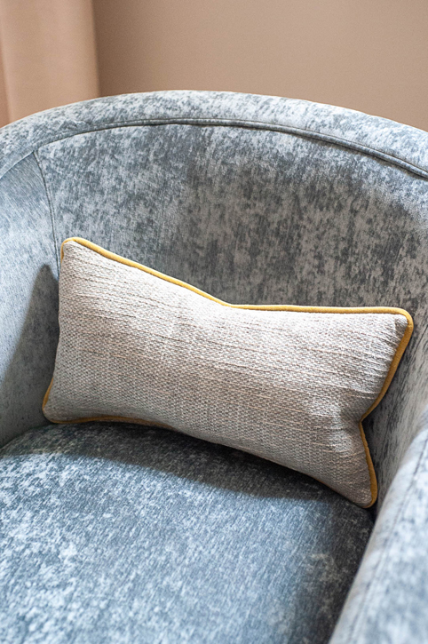
In our Society Hill living room, we created two conversation areas and opted for a largely neutral palette when blending our client’s more contemporary style with the historical architecture of the home. On the swivel chairs’ lumbar pillows, we added a pop of citron yellow velvet cord trim. It catches the eye and never fails to make us smile when we see this sunny little detail!
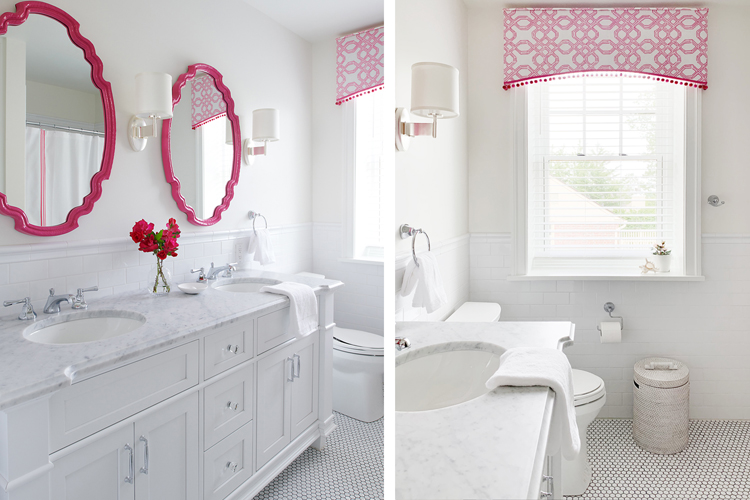
5) Wyndmoor girls’ bath
Speaking of fun, designing a bathroom for two little girls at our Wyndmoor project was just that! We selected a vibrant hot pink to accent the space, which ensured that as these sisters get older, the bathroom won’t feel babyish or outgrown. Pom pom trim on the pink-and-white patterned cornice adds unique style without being too much, and we know they’ll love this space for years to come.
Which of these is your favorite? Do you have another that you don’t see included here? Let us know in the comments or on Instagram!
Want our weekly blog post delivered right to your inbox? Click here to sign up!
________________________________________
Glenna Stone Interior Design is an award-winning Philadelphia interior design firm serving Philadelphia, the Main Line, and surrounding cities. Utilizing her background and training in interior design, architecture, and engineering, Glenna specializes in creating interiors for residential and commercial design settings. We invite you to visit our website, view our portfolio, and catch up on the latest interior design concepts on our blog!