New Hope Farmhouse – Kitchen and Pantry
The second part of our New Hope Farmhouse project reveal, the kitchen and pantry, is here! These fresh, airy spaces were redesigned with some modern touches while staying true to the historic nature of the original farmhouse. Check out the before and after!
New Hope Farmhouse – Kitchen and Pantry
Much like the family room, our clients felt the need for both a lighter and brighter aesthetic in the kitchen and pantry as well as improved functionality. Their wish list included taking out the existing stone arch, creating better and smarter storage, and making the spaces more livable and usable from both a day-to-day and entertaining perspective.
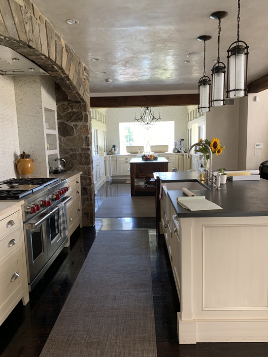
The existing design felt closed in, and we wanted to highlight the features that they loved while giving them a new layout that was tailor made to fit their wants and needs. In working spaces like these, adjusting for improved function as well as style is essential!
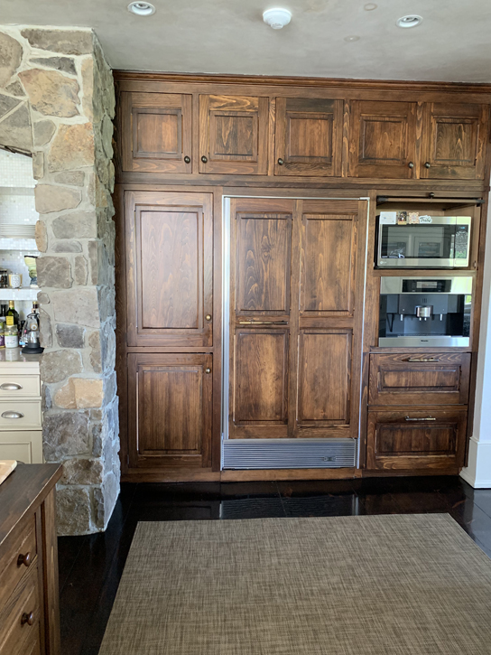
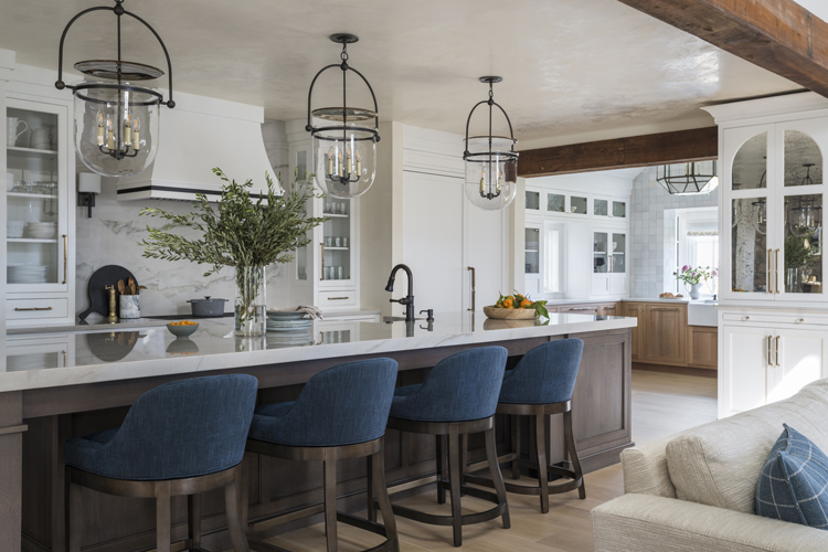
For the kitchen itself, changes such as a quartzite slab backsplash, reconfigured appliance layout, and new cabinetry in fresh white with glass fronts on the uppers gave that fresh, clean look.
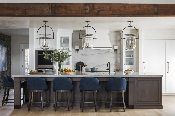
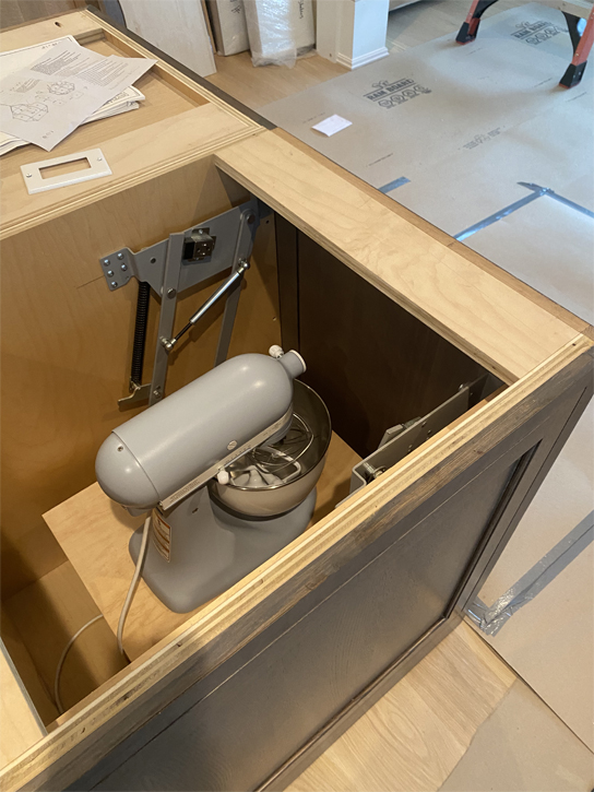
The custom island in contrasting wood features hidden specialty storage, such as a dedicated cabinet for our client’s beloved stand mixer. One of the pain points in the previous design had been how cluttered the space felt with items like small appliances, and solving these is always a great moment in creating the design concept!
We also designed a coffee bar on the previously unused short wall between the family room and pantry, with antiqued mirrors inset into the upper cabinetry panels to tie into the upscale farmhouse vibe. Iron and glass pendants above the island evoke a carriage house touch. It was also important that the furniture-style island itself function as a surface for hosting frequent gatherings as well as the clients’ annual Christmas Eve open house!
The pantry is one of the features of the home that the clients love best; with windows on three sides, it offers views of the private driveway leading up to the house on one side and the farm on the other. As with the kitchen, this space felt crowded, particularly with its large island that restricted the flow from the kitchen into the pantry.
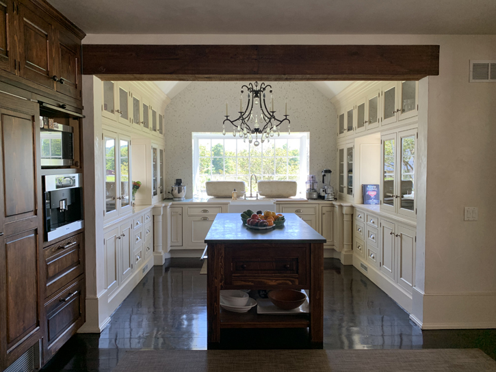
The redesigned pantry incorporates materials that complement the kitchen finishes. New cabinetry throughout features more clean lines, with the lower stained wood adding contrast and depth. The mosaic tiled wall surrounding the bay window creates a central focal point above the larger farmhouse sink that draws the eye back. In place of an island, a local fabricator created a custom marble-topped table with an iron base that offers prep surface while still allowing ease of movement. Overhead, the oversized glass pendant allows for more reflected light and makes the space seem even larger and airier.
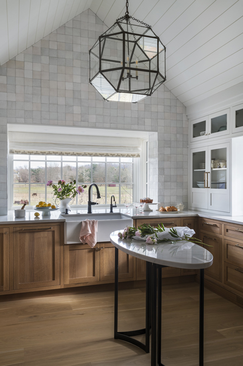
Now, our clients have a fresh, bright space that works just as well for dinner for two or entertaining a crowd of 25, and feels authentic to its setting. What’s your favorite aspect of the redesign? Let us know in the comments!
Project photography: Adam Kane Macchia
Want our weekly blog post delivered right to your inbox? Click here to sign up!
________________________________________
Glenna Stone Interior Design is an award-winning Philadelphia interior design firm serving Philadelphia, the Main Line, and surrounding cities. Utilizing her background and training in interior design, architecture, and engineering, Glenna specializes in creating interiors for residential and commercial design settings. We invite you to visit our website, view our portfolio, and catch up on the latest interior design concepts on our blog!